One of the suggestions from my initial crit on Monday was to look into, with the prospect of using type from branding surrounding Sideling Hill. There are a few things floating around on google and related website that I have collected here for reference
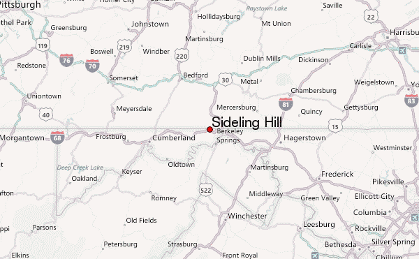 |
| Maps could be an interesting avenue to look down aside from the contour line idea that I am already developing. If I could find older maps somewhere that could further the depth of my context |
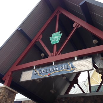 |
| Fairly modern signage solutions such as this are interesting as it gives me an idea of how people in the states might interpret Sideling visually as of course I have never visited the area |

 |
| I find amateur edits like these two intriguing. I wonder how much thought the creator put into typography and if so what message they were trying to get across |
 |
| Here is a very modern mass produced aesthetic for a drone video. Interestingly they've gone for flat serifs giving an idea of landscape I guess. I should look into the effect of serifs |


 |
| old and new American road signs like these could be a good source of inspiration for: shape and form, colours and actual typography itself. Definitely something to explore. |
 |
| I have noticed there is a lot of graffiti around the abandoned concrete bridges and brick work which could be an interesting area of research |
 |
| This old 60/70s name sign is very aesthetic and things from this era do interest me however this is unfortunately the only image from the era I could source. |
No comments:
Post a Comment