However, as the trend fizzled out any association with fashion typography was a major “faux pas”. Rendered as tacky, excessive and kitsch, bold designer logos were forced off clothes and onto slightly more subtle means of branding. Of course, there were still the obvious exceptions of designers, such as Moschino or Katharine Hamnett, that continued to splash theirs with a humorous approach, but for the most part logos were neatly tucked away in bag linings and discrete clasps. Circa SS 2013 and the designer logo begun to make a distinctive comeback. Even though its importance never really exited our consumer driven consciousness, something had changed significantly. Irony and humour was added to the equation.
Partly taken from article 'Typography Is An All-Time Classic Fashion Trend And Heres Why' by Type Room
Here is an example of generative type used in fashion as a promotional video for Issey Miyake's A-POC line website. The animation is very nicely done and could definitely act as inspiration for branding within my own project.
Contemporary examples:
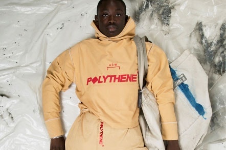 A Cold Wall* by Samuel Ross appropriates industrial graphic design, technical and safety clothing to create a highly aesthetic brand identity that has taken the street wear market by storm, winning Samuel Ross the British fashion council up and coming designer of the year for 2018. The typography follows a number of contemporary trends with italicised fonts and blocky san serifs occasionally mixed with serif forms and outlines for contrast. The colour pallets are often muted or neutral cut by bold accent colours. The minimalist logotype features on neatly every piece as a perfect example of how hype can be generated by heavy yet tasteful branding.

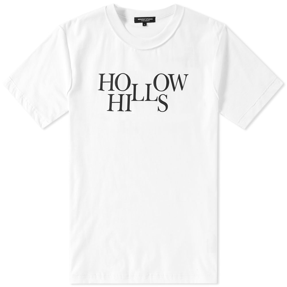
Midnight Studios by Shane Gonzalez
Works with an element of nostalgia and appropriation of popular culture like Liam Hodges but based more around the punk and post punk scene. With clear inspiration from classic collections by legends of fashion such as Raf Simons. Midnight focus on cool and moody quotes and clever logotype style designs to produce a range of ready to wear. Nearly always with a black and white colour pallet at the heart of their designs the typography takes centre stage with a wide range of faces, often serif, in keeping with the desired aesthetic. Most releases are based on 70s and 80s nostalgia but the midnight rave collection is of course more 90s hence the sci-fi futuristic typeface. 


Wearing Your Voice with Fashion and Typography
One important facet of graphic design is considering how typography sits in physical space. Not necessarily in an architectural sense, although it could apply. I mean that designing messages outside of any digital platform requires an understanding of how the viewer will see it. Billboards, for example, need to be designed considering the distance at which a driver will see them. If the headline or supporting text is too small and nobody can read the signage, a grave mistake has been made. But the same thinking could be applied to posters on the street or signage in a window. The function of the typography follows the form of the message.
But those specific applications have the benefit of being static, unlike typographic approaches in an art form like fashion. Typography and fashion have always mingled affectionately, and the typographic form moves from being functional to attitudinal. Typically, clothing isn’t met to advertise in the same way a poster would. Rather, typography in fashion represents the fashion designer and thus the wearer more than anything else. With that being said, both type and fashion change with the trends, representing cultural ways of thinking at any given time period. So let’s examine some current trends in fashion typography and what cultures they reflect.
Brand Labels
One of the most popular typographic movements of the last few years is the modernist trend of labeling. This ignores massive statements or accompanying design, emphasizing the brand itself and solely that. It’s a restrictive approach that benefits the brand directly, but for better or worse, puts weight on the name or logo of said brand. It is a good sign of whether a brand can stand proudly on nothing but their name. (Examples include Supreme, Gosha Rubchinskiy, Champion.)
Anti-Culture / Anti-Fashion
Alternatively, fashion and typography both have roots of anti-culture that distort perceptions of what a clothing garment is and should be. Often these play on established cliches, an expected look twisted to a designer vision. Raf Simons continues to poke fun at prep aesthetics with tattered varsity sweaters, while Balenciaga had fun adapting the logo and typography from Senator Bernie Sanders’ last presidential campaign. Both use typographic aesthetics that belonged to a certain time, place and have considered what those messages meant plastered across the human body. (Examples include Raf Simons, Balenciaga, Vetements)
Revivalism
This aesthetic is somewhere between the past and present, taking clothing styles and typography of old for adoption in a modern setting. Cooper Black, a prominent typeface released in 1922 still finds a home on modern garments, it’s weighty message finding a home spanning almost a hundred years. Kanye West chose to reappropriate Copper Black’s letter for his most recent ‘Saint Pablo Tour,’ while 424 Fairfax often evokes Sex Pistols era punk with their distressing and patches.
Technological and Modern Distortion
With the rate of technological advancements increasing daily, fashion finds inspiration in the speed and distorted worldview that constant digital influence creates. Cav Empt is at constant war with its audience, world, and products, which comes off as bloody clashes between branding and online imageboards. Groups like Off-White create actively dirty their own brand and others, their intention covered with spray paint and stock word choice.
So next time you wear a garment with any meaningless phrase or minute worded logo, take a second to appreciate the type. Good or bad, the message is inherent down to the labelling.
No comments:
Post a Comment