
Research began with a trip to the library where I picked up three books that all feature 'mapping' in the title but explore the topic from three very different angles. The first and most basic of the 3 is 'Mapping Graphic Navigational Systems'. The book starts with a general introduction to mapping which included a number of paragraphs of interest:
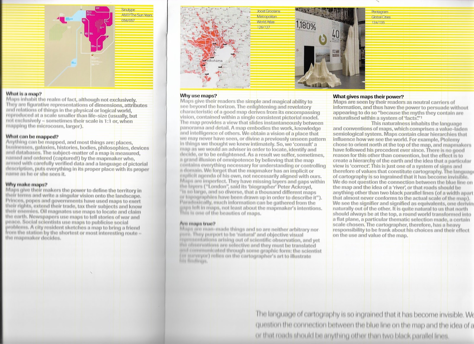

In the first image, its mentioned that maps inhabit the realm of fact most of the time but not exclusively giving a very open definition and touches upon the fact that no map can ever be accurate. These are relevant sentiments to remember throughout this project. The second introduction page the key paragraph is titled 'How far can we stretch the meaning of 'map'? This paragraph discusses the application of mapping that's far detached from geographical documentation. This more conceptual area of mapping is the niche I would like to pursue as I feel a geographical map or even something that resembles one would make for a boring project.
The book then goes on to give a vast collection of largely commercial mapping projects previously undertaken by designers and studios, some of which are shown below:
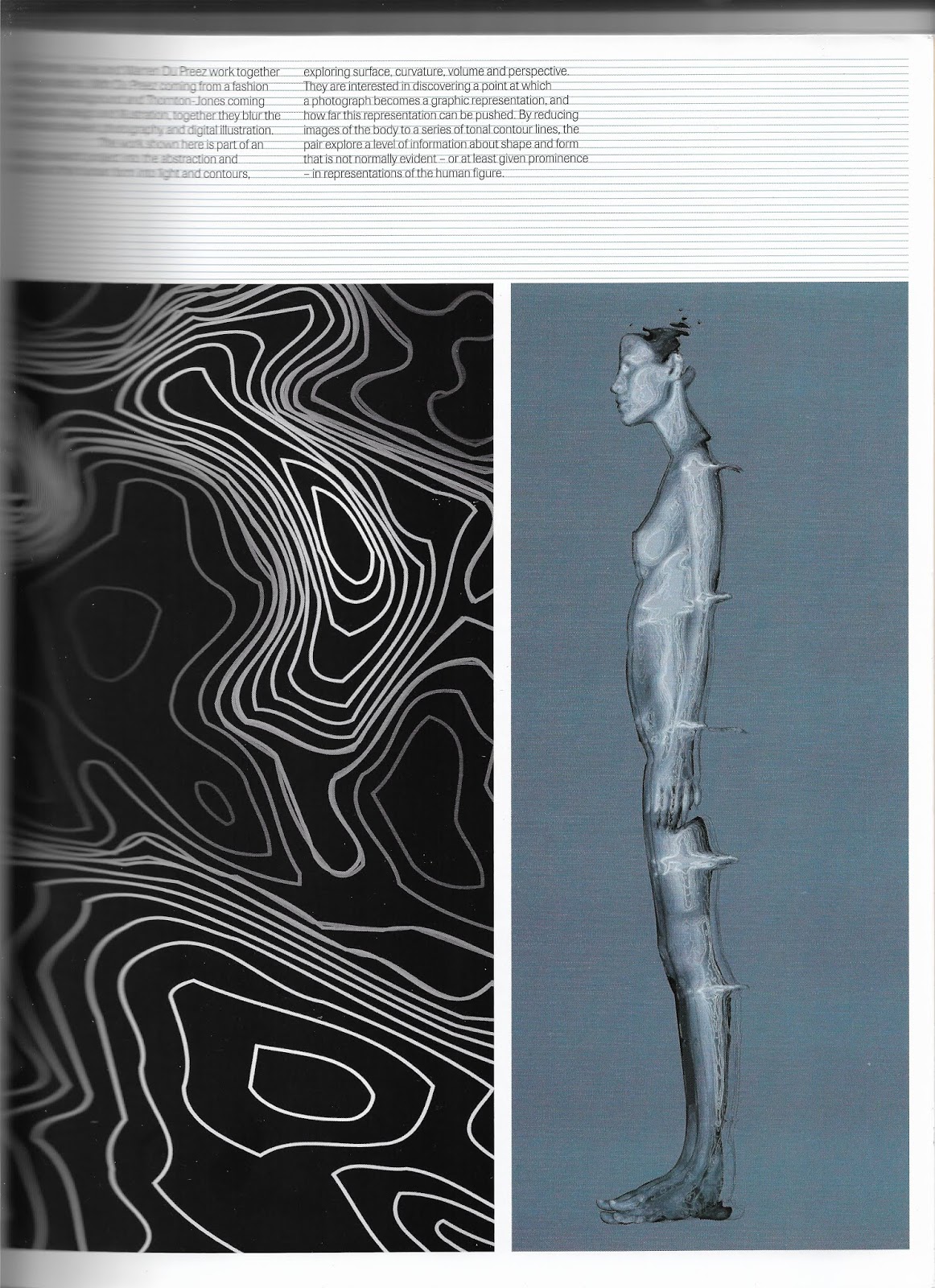
Nick Thorton-Jones and Warren Du Preez use methods of photography and digital illustration to create abstractions of the human form based on light and contours. The aim is to create a graphic interpretation of an image. The simplification of a photograph allows for fresh insight into certain areas of the image. This is a loose use of the term 'map' as its purely visual documentation, in this sense anything that is produced can be argued to be a map of form.

Peter Anderson produced a physical piece for the St Lucia Museum of Art. He took inspiration from the tall wooden poles seen across the Caribbean island, the poles used throughout society to prop up banana trees or build houses. The poles were each given a colour and a number creating a new set of wayfinding coordinates for the Islanders to give their own meaning and use to. The idea of reliance of the island on the poles is an effective vessel for mapping and an ethic that it would be nice to appropriate.

Colours by Jeremy Johnson maps the CMYK breakdown for every pantone colour. I think there is a beauty in the meticulous documentation that this features, the information is in a way useless but visually interesting.


 Another poster by the same studio charts the same data but for the subsequent year. The data is laid out in another innovative geometric pattern that allows the patterns of nature to be simplified and graphically portrayed.
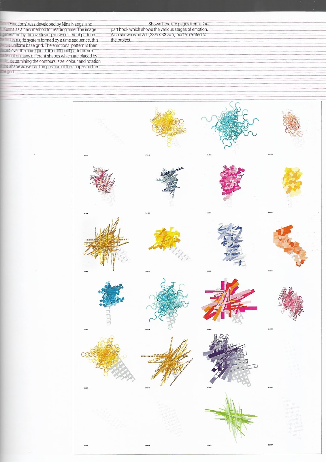
These illustrations are taken from a book by Nina Naegal and A Kanna. The two artists pitch a new method for reading time. One set of pattern portrays the emotion of the illustrator which is then overlayed on top of a grid layout denoting time. This subverts the rigidity of our practical methods for time mapping and incorporates a human element.
No comments:
Post a Comment