'Hello Sol,
Thank you for getting back to me so quickly, I really appreciate it and also glad you are interested in joining in a collaboration. I have three designs and three graphics students so instead of giving one person all of the designs and taking up most of their time, I will just be giving you the one. The Deadline is the 28thMarch; however, I appreciate that you have other work to do as well. If the deadline can’t be met please create a substitute that can be used to show a prototype and you can work on the type until the 10thApril. If you could keep me updated and send some thumbnails of the work in progress, I would be grateful.
The book I would like you to create type for is called Howl's Moving Castle by Diana Wynne Jones. Please see attached the illustration that you will be designing your type around. Honestly you have free reign on how you would like to do this, just keep in mind that this is a book cover and that it must not massively take away from the illustration but compliment it. Thank you again for your interest and if you have any questions or any problems arise please don’t hesitate to contact me.
Kind regards,
Jessica.'
Here is the provided illustration:

I admire the free reign she has given me for the design and appreciate that the type should not be overly elaborate so as to not detract from the illustration. When it comes to the illustration itself I think it is a fairly promising visual language to be working with. I appreciate that this must be quite an old, traditional, almost fairy-tail like book, hence I will need to produce type accordingly. However the traditional layout and border is offset by some fairly contemporary looking illustration, especially via the pictograms in each corner. This sounds like an interesting challenge as I have never done anything fitting this eclectic genre of type before. The first step with my research is to gain a basic understanding of the book without going to the trouble of reading it.
I found the following on supersummary.com:
'Howl’s Moving Castle, a novel by Diana Wynne Jones published in 1986, is a fantasy story, and the first in a series of novels about a powerful wizard, Howl. It is the story of a woman, a wizard, and a series of curses that must be solved.
In the book, Sophie is the oldest of three sisters. She lives in Market Chipping in the fantasy kingdom of Ingary. In this place, it is believed that the eldest will never be successful, and so she has resigned herself to this fact. She works selling hats at a shop every day and makes the most beautiful dresses.
One day, a witch comes into the shop looking for her younger sister. She believes that Sophie is that sister, and when Sophie will not tell her how to find a wizard named Howl, the Witch of the Waste turns her into a crone. She cannot work at the shop anymore, so she leaves and finds work with Howl as a cleaning lady.
She meets Howl’s fire demon, Calcifer, and he agrees to change Sophie back if she can find a way to break the contract between him and Howl. Part of the contract is that neither Howl nor Calcifer can disclose the details, so Sophie must guess what will break the contract.
Howl has a reputation for eating the hearts of young women and other terrible acts, but really, he spreads these lies so he will not have to do any work and everyone will leave him alone. His castle door is a portal and opens in four different places, one of which happens to be Sophie’s hometown. Howl soon realizes that Sophie is under a curse and attempts to break it, but he is unsuccessful.
His apprentice, Michael Fischer keeps all the day-to-day details running. Howl spends hours each day in the bathroom, and Michael tells Sophie that the day he does not make himself beautiful for a girl is the day he is in love. Together, Howl and Michael court Sophie’s younger sisters, Martha and Lettie.
Prince Justin and the Wizard Suliman go missing. The King orders Howl to find them both, a task he is unwilling to do. The King also wishes for him to kill the Witch of the Waste. However, she is a jilted lover and has placed a dark curse on him. Howl sends Sophie to get him out of the job, but she inadvertently gets him appointed Royal Wizard, a job he had been skirting for years.
Sophie believes the Witch has taken Howl’s current love interest, Lily Angorian, captive, but when she attempts to save her, she discovers it is a trap. Howl comes to save her; he is disheveled with his hair in a mess. This proves that he loves Sophie. Lily is actually the Witch’s fire demon in disguise. The fire demon, which Howl knew had taken control of the witch long ago, now tries to take Howl’s heart.
He defeats the demon temporarily, but ultimately the demon wrests control of Calcifer away. Calcifer had been guarding Howl’s heart all along. Sophie uses her ability to bring things to life to break the contract safely without killing them, and with the death of the Witch of the Waste, Howl is saved. Calcifer is then able to break the spell returning Sophie to her proper age.
When he awakens, Howl destroys the fire demon once and for all, and breaks the curse put on Prince Justin and Wizard Suliman. The witch had combined them into a perfect human to use to control Ingary. She had intended to use Howl’s head to complete her project.
In the end, Michael and Martha are in love, as are Wizard Suliman and Lettie. Howl and Sophie admit they love each other, and Howl seems willing to love happily after. Sophie does not disagree.
Howl believes himself to be so powerful that nothing can stand in his way. If he wants something, he is well within his power to have it. Sophie, on the other hand, believes strongly in fate. As the eldest, she believes the old ideas that the eldest will never be successful then, she subconsciously sabotages everything in her life to fit this trope. It is only at the end that she is able to overcome this idea.
Appearances are also a concern for all the characters. Appearances are not always true. Sophie is a young woman cursed to live in a crone’s body. She is comfortable with this look because it protects her from having to think too much about her future. Martha disguises herself as Lettie and uses that disguise as a way to find a real suitor. Howl spends hours making himself beautiful, but only when he is willing to let go of his appearance do we find out that he is truly in love.
Howl’s Moving Castle is a fantasy story that deals with issues of identity and fate. It is a wonderful story about the ways that outward appearances can be deceiving, how we can overcome our own perceptions of what we can do—even an ordinary person can save a powerful wizard if she is in love.'
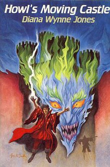
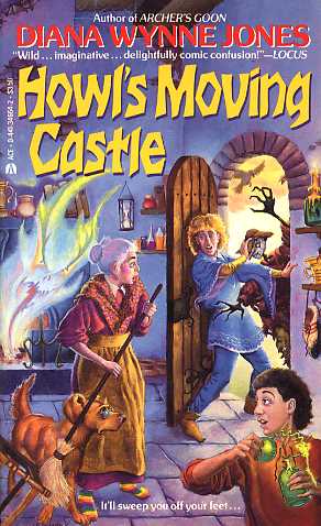
With regards to the type used, there is a real mixture of styles with a few book designers going for a vaguely gothic blackletter aesthetic that is popular amongst this genre due to its conception during medieval times. I am not very accustomed to traditional calligraphic typography, making this style an exciting one to attempt to replicate. Other book designer go for a decidable dated but yet far more contemporary, almost 70s or 80s style typeface. The even width strokes and dynamic type direction seem at odds with the story, however these are probably just old designs from around the time of the books first publishing in 1986. I think a serif typeface will be most suitable here.


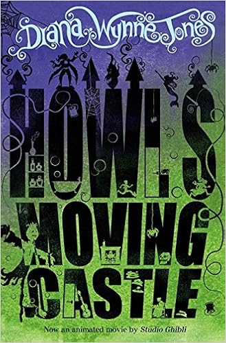
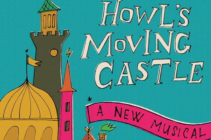
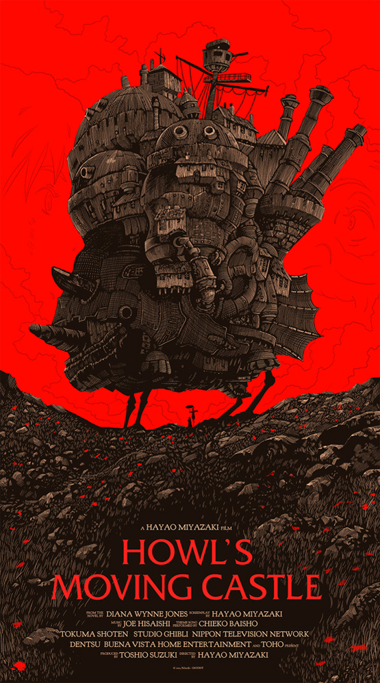
With regards to the animation and musical based typefaces. The common factor appears to be the disparate nature between title text and author name or description. This is most prominent in the Studio Ghibli production (below left). A very elaborate and genre cliched face is used for the author name in stark contrast from the elongated possibly Helvetica bold that features for the title. Upon closer inspection however its clear to see how the decorative type has fits in as the blocky forms are only meant as a graphic vessel for illustrative work. This is an effective reference to the story as the hollow letters can be rationalised alongside the shallow nature of the characters around their looks and how they may define their fate.
The sketchy hand drawn aesthetic for the musical poster has an element of play and movement to it that reflects the core principle of Howls castle moving. Also the hand drawn element could be used on my project due to the covers illustrative properties. However, the cover provided by Jessica is actually very graphic in style, meaning something more defined and vectored will probably suit the brief better.

Moving onto the anime adaptations it is clear to see a big shift in graphic language, as can be expected due to the change in: target culture to Japan, year of production to 2004 and the move from the printed page to the crisp vectors and RGB colours of anime animation. Although I am not being asked to create type for the animation I still think it is a valuable area for visual research. This is in part due to Jessica's illustrative style falling somewhere in between the two visual narratives of the book and animation. This could be intentional from her despite it not being mentioned in the brief.
With regards to typography a blocky san serif similar to the animation poster above features in one of these Miyazaki remakes, once again playing with the idea of transparency of character and values with the background featuring as part of the letters. There are two posters using the official 2004 release typeface Albertus. Which was Designed by Berthold Wolpe in the period 1932 to 1940, a glyphic, serif typeface named after Albertus Magnus, the thirteenth-century German philosopher and theologian. However the 15th anniversary poster uses the original, more pronounced face whereas the red background poster has a cleaner, contemporarily adapted version. The face has a slight nod to the traditional blackletter with a copperplate-esq subtle serif on fairly monospaced strokes. I think this is quite a good compromise between the old english visual language of fairy-tails and a contemporary aesthetic. The red type (middle right) has a sketchy, almost hand painted line quality but is otherwise a quite geometric, regular san serif. This is worth noting as a way of giving an element of play to an otherwise serious typeface. Also the entasis on the HMC as the leader of each line is perhaps a subtle reference to blackletter, where the first character of the line would be heavily accentuated. In the bottom right there is a distinctly black letter interpretation but without the script-like flourishes we would normally associate with the genre, this may be due to the slightly Japanese strokes of a robust blackletter as the designer tries to create an internationally popular aesthetic.


No comments:
Post a Comment