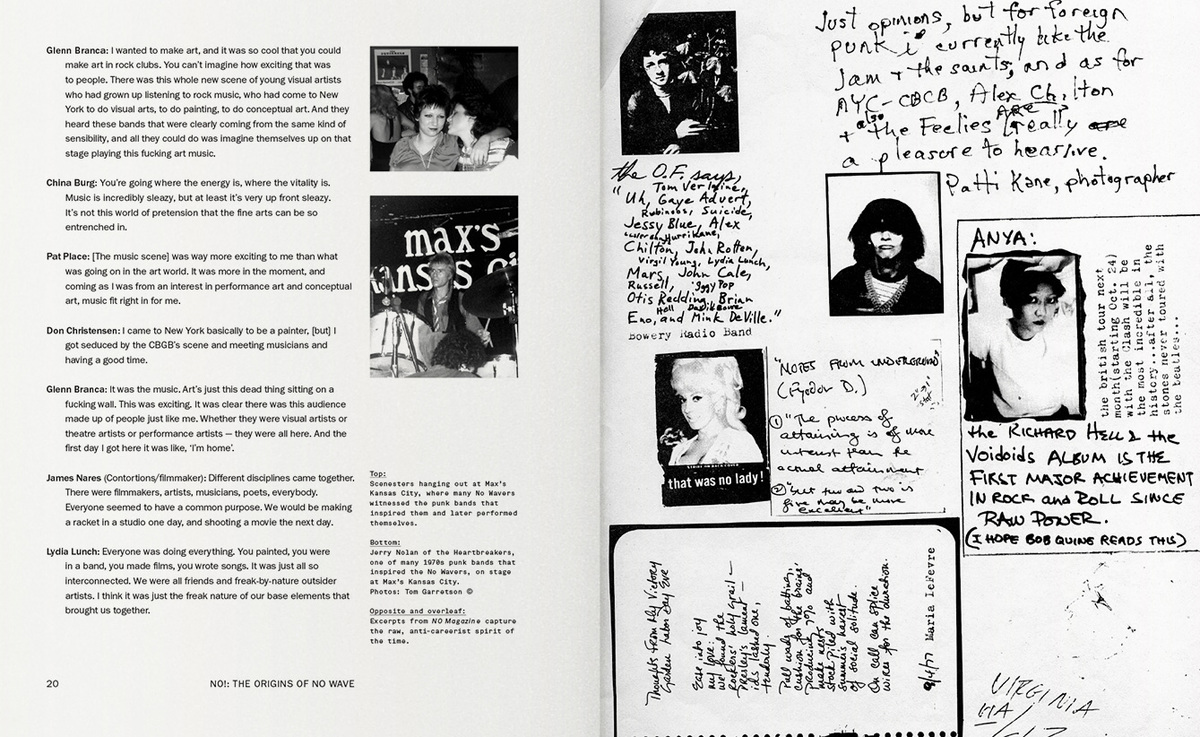
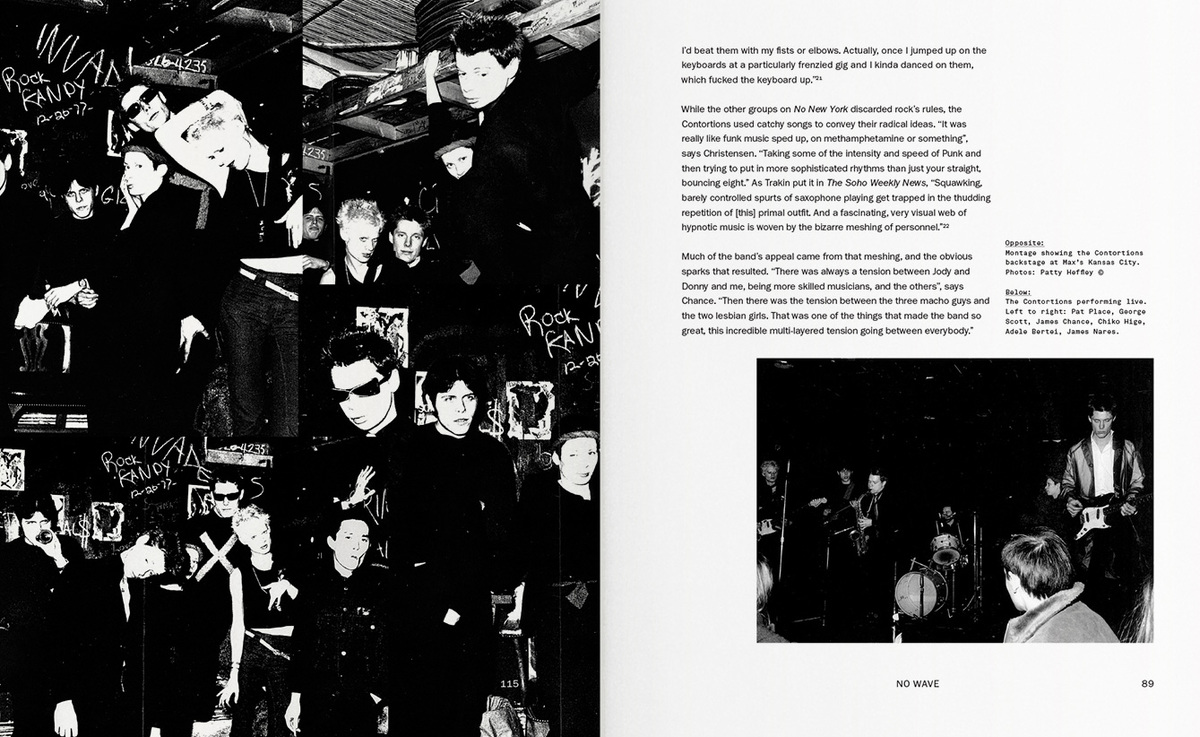
The other book was far less visually interesting with more regimented sanserif type internally and far more conventional grids of pictures and large-scale black and white film images. However, for the type, it's worth noting that once again blocky bold sanserif is favoured - in this case, the logotype was printed grainy as if it had been screen printed on. I need to look into printing techniques that might give me the desired lo-fi aesthetic. This typeface is also far more geometric and rounded which I feel makes it look very much so of the era but possibly too much so of the popular culture within the era. My typeface should not be as conventional.
Further inspiration came from my research into Basquiat and via the documentaries I have watched and the use of graffiti in Jan Jarmusch's film Permanent Vacation. The casual nature of simplistic graffiti lettering is something that I feel really embodies both the lo-fi and anticonformist nature of the movement.
Lastly, some contextually unrelated research was supplied by the logotype for Japanese Anime film AKIRA. The logotype features the fusion of heavy serif roman alphabet with Japanese characters that are clearly designed to look painted on. This fusion of disparate styles is exactly what I am aiming to achieve within my typeface. This lead to experimentation seen bellow before progressing to a full typeface using original forms. 
All of this research accumulated in this typeface and some slight variations that look to combine the hard neo grotesque forms of the sanserif within the books with the freeform lines of graffiti. The idea behind it is that the black elements of design can easily be created via taping and then the drawn lines via a paint pen or a spray can - this fits with the lo-fi makeshift theme. The colours stay with the classic black and spot colour of red for now although I'm open to changing these in future. The forms are possibly too blocky and hard without the lines and maybe with them also so further experimentation is needed for sure. The rules behind the face are: only horizontal and vertical lines to be blocks and any diagonal or curved forms have to be done with the drawn line. One possible problem with this is that the differences between O and X, for example, are so vast. Also in theory O could be done all in pen also so it tricky to know how to apply the rules to each letter.


No comments:
Post a Comment