We also looked at the works of Andrian Frutiger and Charles Morris, both graphic designers were known for their literature that provided groupings of semiotics.
Pictograms are a type of symbol usually used to give immediate information. They easily convey vital information regardless of culture or language, and should not be misleading.

One pioneer of symbols was typeface designer Adrian Frutiger who released his book on the subject in 1978. In his book, Frutiger created Morphological Table 1: a series of symbols created using a maximum of three horizontal and three vertical lines. From these, he found that he could create a variety of symbols with meaning. I can vouch for their effectiveness as nearly the entire room voted synonymously when considering which of the symbols meant the following:
· Object
· Container
· Protection
· Beginning
· End
We were asked to pick out the objects we felt represented these words and the class was mainly in agreement with Frutiger for each one. This shows that a universal visual language is very realistic within people of the same culture. The challenge is then translating symbols further afield into cultures where their language works far more pictographically anyway.
Frutiger categorised these into 5 groups:
· Closed
· Open
· Open and Closed
· No connection (which were not considered symbols due to their disconnected appearance)
· Letters (which Frutiger also did not consider as symbols as they already had meaning)

In his 1938 books Foundation of the Theory of Signs, Charles Morris defined semiotics as grouped into three branches:
Semantics: the relation between signs and the things to which they refer
Syntax: relations among or between signs in formal structures
Pragmatics: the relation between signs and sign-users or interpreters
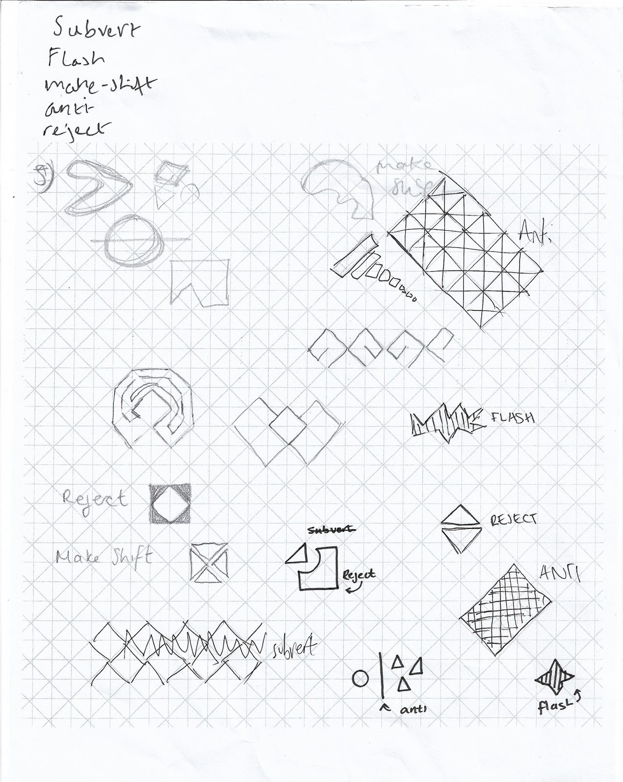
Despite them not being one of our deliverables I can see how pictograms are a good starting point, getting us to boil down our genre to a more defined visual style. However as is often the case with these tasks I did feel very pressurised and rushed as we were tasked with churning out as many sketches as possible with restrictions added for each one and peer input required. We started by using a grid that was used by Otl Aicher which restricted our ideas and made them come out in a certain way. I think the regimentation didn't particularly suit the No Wave aesthetic, however merely identifying this was helpful. I strayed from this to incorporate a mixture of angular and curved forms.
In the peer task, we selected 5 words and then peers had to draw pictograms for them. Insight I should have selected by 5 words before the task as we were only given 30 seconds to choose. If I did it again I would have probably included New York as the city itself is essential to the movement and downtown as a replacement for 2 of subvert, anti and reject. However, some of the peer sketches did spark ideas, an example of this was the square with a circle cut out and a triangular piece trying to fit in. This quite obvious visual language highlights the movements need to subvert mainstream culture as a sort of protest against boring middle America and the mess the banks had got it into.
Initially I worked too much with guidelines around shapes I was trying to make, however, the concept of colouring each individual square by hand with varying amounts of fill was affecting as it highlighted the makeshift element of the genre. The idea of destruction and possibly a rock being thrown through a box was present as a homage to the phrase 'think outside the box'. The invertion of colour also featured and the literal portrayal of culture as waves to be disrupted.


No comments:
Post a Comment