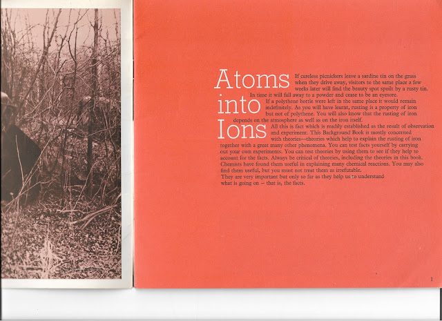
This first example of inspiration comes from an old chemistry book titled 'Atoms'. Although none of my books tackle quantum physics, which would have been the ideal inspiration for this brief, I think the fact that they are based upon principles of science gives them the perfect aesthetic as colours are bright and monotone symbolising energy and reaction yet fitting the serious non-fiction context well. On this specific page I love vibrant redy orange which could possibly be described as 'coral'. The way it fits in with the monotone sepia image on the left and the white heading text and black body is very satisfying. The highly structured serif typography feels very scientific in is structure without feeling too formal which I believe is essential for my cover.
This book on X-ray analysis featured another very striking colour way, however I felt the richness of the red and therefore lesser contrast between it and the maroon did take away from the impact of the first booklet somewhat. I loved the patterns on the front and back cover and how block shapes, photographs and outline shapes are all over lapped and correlated, again conveying the context well
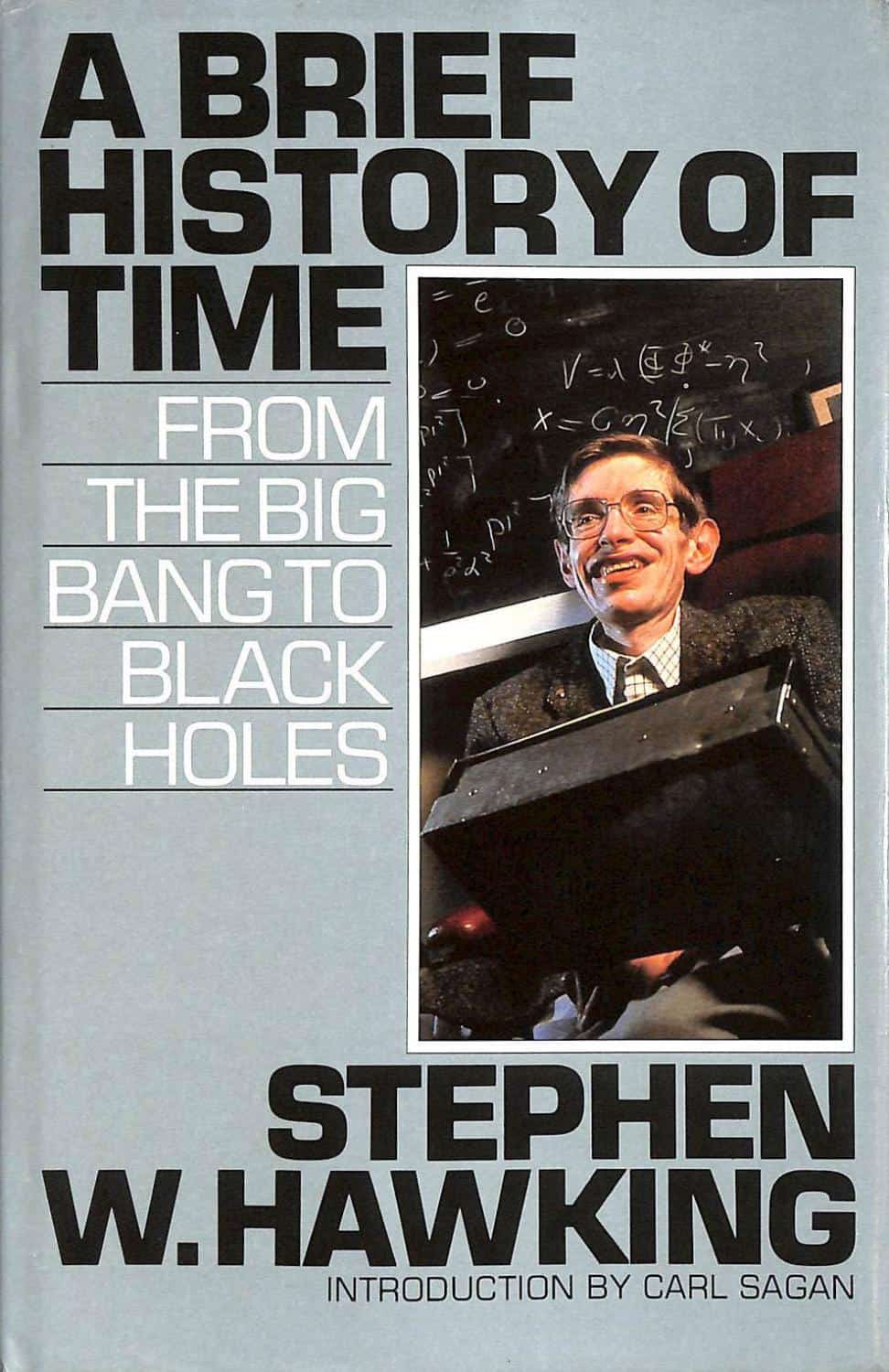
The other book of inspiration was of course the original text, of which I purchased a wonderfully dated edition (bellow left) that had a number of diagrams inside and a muted bluey grey colour. I feel like blue is an obvious colour for the book due to Hawking's connections with Cambridge and its clinical, scientific warmth. For this reason as a challenge I felt it best to avoid large sections of blue where possible. The use of blocky serif typefaces any very traditional text layouts is also popular and to be avoided.


The main diagram that caught my eye was the time-space continuum illustration (bellow) that featured two cone shapes with their points touching at a point that represents the present and the absolute future spreading out above, with the absolute paste doing the same bellow. This generated the idea of using the diagram as a timeline that could be featured on the book design to symbolise one of the key themes in a very graphic way

This is the final, submitted outcome for the competition. The central element to the theme is the time-space continuum which is conveyed via the visual chronology. It starts on the front cover as the viewer sees the crisp navy blue title and then continues onto the spine which has a small circle to represent the present and the back page which had fading elements to represent the past. The fading elements are also a subtle visual reference to how the image of an object going into a black hole remains unaltered but gradually fades over time. These themes are also further via three larger circles overlapping the spine, the future is not completed, the present is solid and the past is fore filled but fading. These circles were inspired by a similar design using overlapping hexagons from the vintage science book research, the orange colouring is also borrowed from this vein. The orange is complemented by a fairly dark but still vivid, navy blue and quotes are separated via a light grey render. The aim was to keep the design fairly monotone and muted to convey the nonfiction content. In terms of typefaces a freely downloaded, highly structured serif called Sanchez is used for the titles, as inspired by a similar face found in research. Plain old Arial is used on the back cover for maximum legibility, because the background isn't a consistent colour so using anything less legible would risk usability. This is probably my least favourite component of the design as it doesn't really harmonise with the rest of the back cover and spread in general. The back was certainly rushed a bit to get it finished before submission as I had left all of the making to be done yesterday due to balancing lots of work at once. However I am happy with the outcomes, even though I know it is incredibly unlikely I'll be shortlisted when the competition will have far more polish and developed ideas. With this being said, I am still very happy I made the effort to get an entry in and feel that the design I have submitted is to my usual standard, despite its last minute nature. The concept is strong, the aesthetic is appropriate and innovative and the project has reached completion. One concern I do have is as to whether the concept is obvious enough as it makes perfect sense when you know what its symbolising but could seem a bit random without context, so hopefully I'll get to the next round where I can submit a rationale.


No comments:
Post a Comment