I have decided so pursue Stephen Hawking's nonfiction book on cosmology, 'A Brief History of Time'. My reasons for this choice are that looking back at previous winners and other books on the market I feel an illustrator would be best suited to the children's been category and I feel I know Animal Farm too well due to studying it at school. What I mean by this is that the story of Animal Farm is so widely known that it automatically triggers certain imagery and the market is already very saturated. I would struggle to maintain interest and motivation with such an obvious book. On the other hand with 'A Brief History of Time', I have some initial interest in the concept and perhaps due to its in depth context and the fact its nonfiction, it has not been explored from a design perspective nearly as much as Animal Farm. From what I did find online with a few quick image searches, past covers have been largely to the point with highly regimented, typography lead designs. More recent updates feature very stylised graphics that represent elements of the cosmos, often black holes which are one of the key theories within the book. The graphics look too clean and like something off doctor who, therefore I'd actually rather take inspiration from the very dated 1980s designs such as the one bellow (top left). I enjoy certain elements of this postmodernist aesthetic and feel there is definitely parts of it that can be developed. The key will be creating designs that are still visually interesting whilst still maintaining the structure and link to a time when this book was truly groundbreaking.


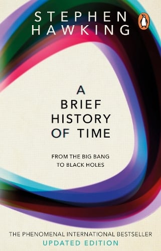
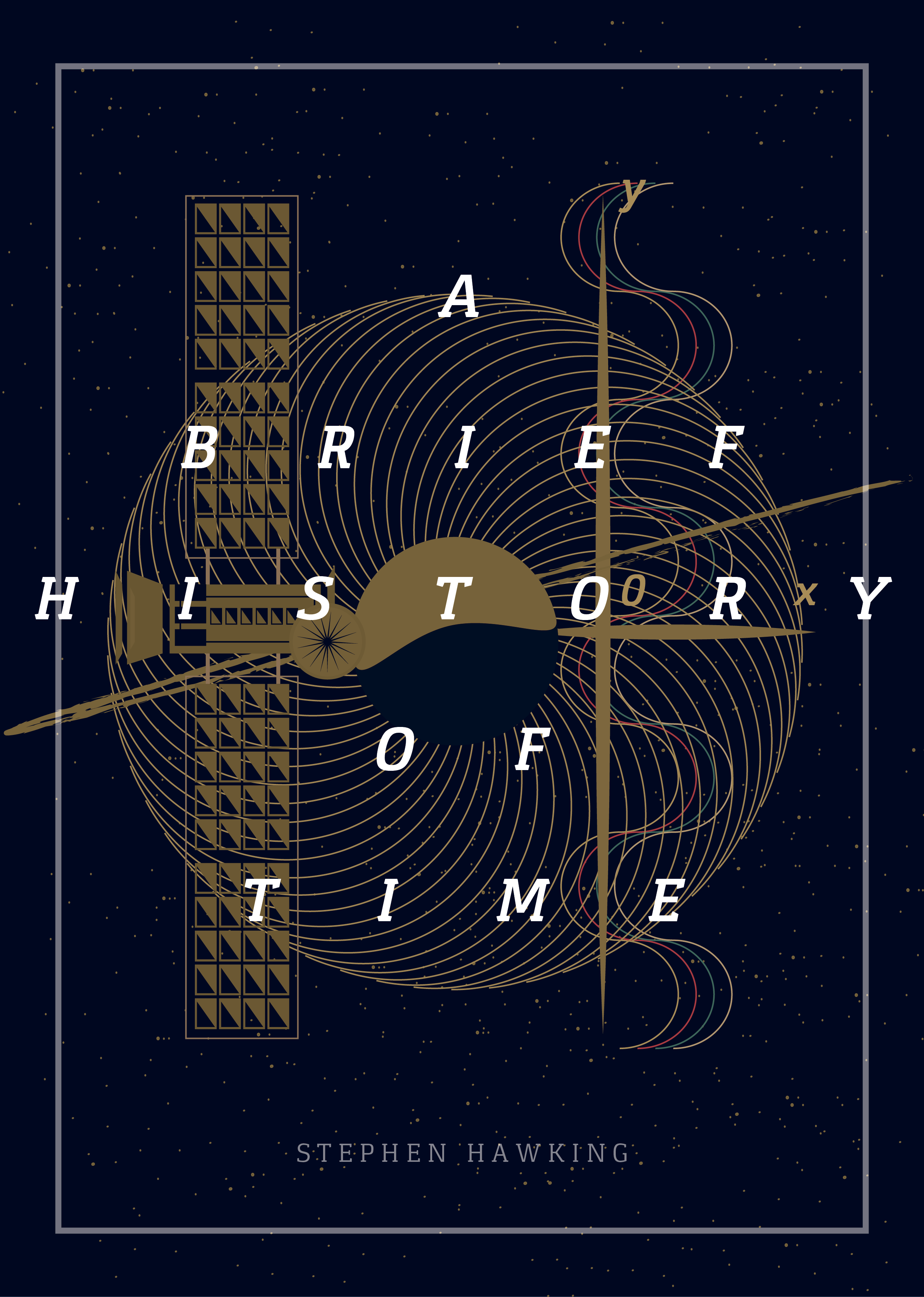
In terms of other potentially amateur graphic designers interpretations, I found a few images online. The designs seem to largely feature some kind imagery relating to black holes or clock faces as they often feature circles. Due to these two sources of imagery being particularly prevalent in the book it is tempting to also follow this route although I would have to do so in a completely unique way or avoid it all together to have originality. Scientific diagrams also feature heavily and some books (not included) show black board writing and equations. These features feel a bit too static, 2D and boring, perhaps though I could include these elements but only if I interpreted them in an original way for example adding another dimension and making diagrams into 3D objects. In terms of typography san-serif or subtle serif forms seem to be popular with one book (top right) using Gill sans which appears to be a very popular choice with recent editions. Collage as used in the top right book is not a popular technique at all, I should attempt to find a niche like this that isn't often used, however does collage as a medium portray the context well? probably not. Colour pallets throughout are often dark to represent space with some vivid accent colouring which draws the eye in well.


No comments:
Post a Comment