
From a visit to village books a couple of weeks ago I distinctly remember a logo type in which each letter looks to have been twisted around. I had a quick search on their website due to the potential relevance to my Hepworth gallery inspired alphabet. Mold is a
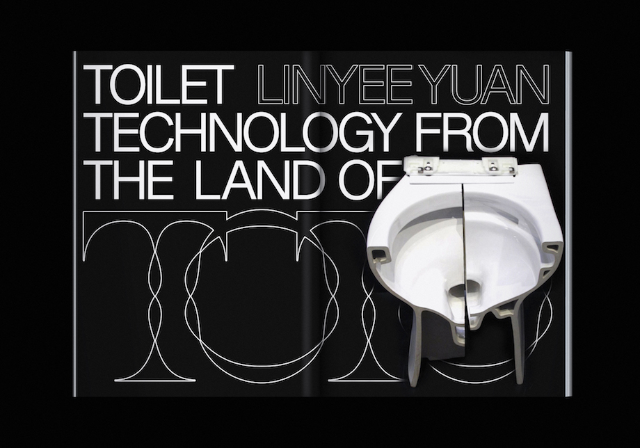
a bi-annual journal about the future of food. The magazine essentially looks at the future of food and how design could effect this future. It seems like quite a niche publication topic and this is, I guess reflected in the logo type the likes of which I haven't seen many similar to online. The typeface, this time, features two vanishing points with the lines created being far more curved than those at the exhibition. I feel the design could still portray Sideling if done right and is something to look into. Its also interesting that both this and the Hepworth typeface are serif, implying as I have suggested that the serif form lends itself better to this kind of abstraction. However I'm intrigued to push on with a san-serif design in search of unique outcomes.


No comments:
Post a Comment