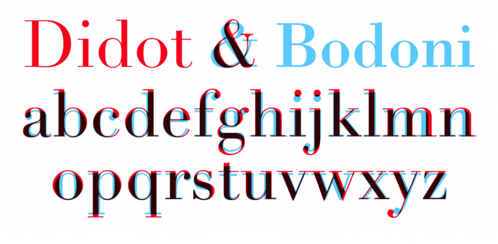
"Over the twentieth century, carrying into the present, one can observe competing aesthetics of modernity, traceable through different uses of the ‘modern’ typefaces of Didot and Bodoni and the ‘avant-garde’ aesthetic of sans serif grotesques. Bodoni was classified as modern because it introduced an extreme contrast between thick and thin elements, achieving a radical consistency among letter shapes by subjecting the variety of the alphabet to a thick/thin autocracy. The result is an abstraction and precision. Bodoni has exaggerated height and verticality of the ascenders and descenders of the letterforms, lending the characters an architectural grandeur. He described the ‘beauties of type’ as ‘conformity without ambiguity, variety without dissonance, and equality and symmetry without confusion. A second and not minor value is to be gained from sharpness and definition, neatness and finish.’
Didot and Bodoni dominated printing until the late nineteenth century when the Arts and Crafts movement returned to the solidity of humanist letterforms and the texture of Renaissance printing (William Morris called Bodoni’s letterforms ‘shatteringly hideous’). After fading from view, Bodoni and Didot made a comeback in the early twentieth century, partly because their geometric clarity seemed modern again. An Italian foundry, Nebiolo, issued a new cut of Bodoni in 1901, and ten years later the largest American foundry, ATF, issued its own very popular cut of Bodoni.
In the 1950s Bodoni (and its clownishly bloated progeny Bodoni Poster) was used in many other ‘design’ contexts. The cover of a 1950 Museum of Modern Art book, designed by Jack Dunbar, prominently displays its title, What Is Modern Design? in Bodoni, as if the question it asks is answered by the typeface, rendered in stark white letters on a black background.
Fashionising fonts
Deriving from a combination of Bodoni and Didot, Didone was used on the most iconic fashion magazine of all time, Vogue. In Vogue’s early pre-photographic covers, illustrators created lettering that worked with the style and spirit of their illustrations. This ethic was carried over as Voguemade the transition into the photographic era: photographers and designers created ambitiously varied and inventive approaches that integrated letterforms as part of a total approach to design. But even in those covers that did not integrate the lettering as part of the overall concept, type choices were extremely varied. As late as 1955, Vogue covers vacillated between serif and sans serif typefaces, as well as script faces and illustrative, photographic letters. It was after 1955 that the magazine appears to have legislated a consistent use of the all-capitals banner headline set in Didone. Apart from minor details, it has remained absolutely fixed since then, the trade-dress of a powerful international franchise.

Deriving from a combination of Bodoni and Didot, Didone was used on the most iconic fashion magazine of all time, Vogue. In Vogue’s early pre-photographic covers, illustrators created lettering that worked with the style and spirit of their illustrations. This ethic was carried over as Voguemade the transition into the photographic era: photographers and designers created ambitiously varied and inventive approaches that integrated letterforms as part of a total approach to design. But even in those covers that did not integrate the lettering as part of the overall concept, type choices were extremely varied. As late as 1955, Vogue covers vacillated between serif and sans serif typefaces, as well as script faces and illustrative, photographic letters. It was after 1955 that the magazine appears to have legislated a consistent use of the all-capitals banner headline set in Didone. Apart from minor details, it has remained absolutely fixed since then, the trade-dress of a powerful international franchise.
Bazaar aesthetic
Flash ahead to 1992 and the Didone aesthetic is powerfully resuscitated in Fabien Baron’s re-design of Harper’s Bazaar. Baron commissioned Jonathan Hoefler to create a new digital Didot, a kind of super-Didot, drawn in extremely large sizes that allowed the type to be set in enormous display sizes while still retaining its razor-thin lines. When I interviewed Baron in 1995 for Eye, he seemed irritated when I asked if his choice of Didot was self-consciously referring to the Brodovitch era: ‘No … We used Didot because it’s very feminine, not because of the magazine’s history. When we started at Bazaar things were very elegant and the direction of the magazine was about elegance.’ He applied the same spirit to his advertising and brand work with Valentino and Calvin Klein, and, more recently, his art direction for a book on Balenciaga.
Flash ahead to 1992 and the Didone aesthetic is powerfully resuscitated in Fabien Baron’s re-design of Harper’s Bazaar. Baron commissioned Jonathan Hoefler to create a new digital Didot, a kind of super-Didot, drawn in extremely large sizes that allowed the type to be set in enormous display sizes while still retaining its razor-thin lines. When I interviewed Baron in 1995 for Eye, he seemed irritated when I asked if his choice of Didot was self-consciously referring to the Brodovitch era: ‘No … We used Didot because it’s very feminine, not because of the magazine’s history. When we started at Bazaar things were very elegant and the direction of the magazine was about elegance.’ He applied the same spirit to his advertising and brand work with Valentino and Calvin Klein, and, more recently, his art direction for a book on Balenciaga.
So why are Bodoni and Didot used so much in relation to fashion, apart from their stylishness and pedigree? Can it be that within the very forms of these typefaces they evoke the precision of tailoring, the flatness of fabric, the dynamics of gathering, draping and folding? In Dreaming by the Book, Elaine Scarry discusses how writers create and manipulate imagery, showing how mental images are subject to bending, folding and stretching. Typefaces perform similar manipulations, conjuring visual associations, rather than purely mental ones. In my mind, the attenuated forms of Didone letters are not unlike the flattened geometries of dress patterns: accelerated curves and tapered rectangles meeting at precise junctures. One can imagine the fine lines of the Didone serifs as the seams and stitches that connect into an ensemble of parts.
While we can speak of this ‘imaginary’ and associative dimension to Didone fonts, we can also point to one of its most salient, pragmatic aspects: it has an almost see-through quality. Because of its radical thick-thin structure, the mass of the letterforms are greatly diminished: words typeset in Didone fonts act as a typographic veil over photography, making them particularly useful for magazine covers. Like Tom Wolfe’s ‘social x-ray’, Didone fonts create an x-ray of the word. Their anorexic, skeletal forms create an ideal overlay for photography. The connection between Didot, Bodoni and the topic of fashion is so embedded that not only do Vogue and Harper’s Bazaar continue to dress in its sparkling linearity, but so do countless other magazines and brands." http://www.eyemagazine.com/feature/article/through-thick-and-think-fashion-and-type
Bodoni has been fetishized throughout many eras and this fetishization has not stopped progressing into the digital age. One of the decisions behind Bodoni's inclusion in this project is a recent project conducted by Pentagram partner Sascha Lobe. Lobe created a Bodoni Headstone Calendar in 2019 to be displayed at the Museo Bodoniano's Segni Esemplari. The calendar features a rework of the classic face called Bodoni 200 finished with clever animations that reveal the faces fluidity via constantly moving overlaid shapes, disclosing forms made up of pixels and other variations underneath.


Lai Ka Ki's publication 'The Type of Fashion: Bodoni' tackles exactly the context of this block post, discussing the times Bodoni has lent itself to high fashion applications and why that may be. The book also discusses how Bodoni might be represented upon a page with an all capitals approach favoured for headings and offset features such as think lines and handwritten script typefaces surrounding the applications.


There are a number of factors to consider when designing my own variation of Bodoni/Didot/Didone. The main one is to ensure that although the face clearly references high fashion magazines it does not form a pastiche of them. Also, there must be a clear and rationalisable link to the ecological problem of fast fashion, the face cannot be glorifying the industry and must be remarkable to gain visual interest.
No comments:
Post a Comment