I went into the crit with fairly little confidence in my designs which, to be honest only materialised to the extent they are at now yesterday. However, I did have at least 5 initial ideas for each element bar perhaps the objects, which are largely variations on the apple theme. Here are the final 5 designs I produced for J cards (front left back right):
 |

This design is inspired by the 'anti' nature of the No Wave scene and the theme of identity holding a ruinous downtown New York together. The concept is to cut up actual New Wave or synthpop or other popular music of the time J-cards by their panels and then reassemble them using tape, therefore creating a unique paper stock that fits with the makeshift elements of the genre. The only thing still to decide is where and how the track and general info will go on but I feel this will probably just have to be screen printed in red on the reverse. I could also increase the size by adding more panels.


This design features my original typeface as well as design influenced by research into the branding of New York. The simplistic design attempts to take the iconic branding and subvert it into something distinctively No Wave. I long pondered over what to include in place of the heart and eventually settled for simply 'NO WAVE'. With no solid cassette name yet I think maybe just the strength of NO is effective. The bitmap image of Basquiat's graffiti fits in well with the tone, however, the design could definitely be further developed. I feel the 'I love N.Y.' branding might not be as effective as the links to the big apple but was worth investigating nonetheless.


This concept would be printed on hand annotated graph paper, giving a contextual link to the early 70s economic crash that made No Wave possible. When this is combined with some distinctively dated design in the form of extra bold Helvetica and bitmap images of hands and apple's the effect is mildly satirical. However, perhaps I have gone too far with the reference and the designs now feel a little too boring as if they are PSA posters. This design allows for the incorporation of my old and new sides concept with the list of the late 70s No Wave to be featured on the front and more contemporary No Wave-inspired work on the back - reflected subtly by the difference in apple image.


I would describe this card as the most 'aesthetic' of the concepts. What I mean by this is it is probably the most 'cool' in terms of design but maybe loses some context and energy along the way. The overinflated and sightly kerned sanserif is arranged in a manner inspired by old, No Wave band, Mars posters. The design also borrows imagery from the Jim Jarmusch film 'A Permanent Vacation', in which the main character is seen with a friend who takes his cigarette out of his mouth and turns it as it is the wrong way round. I felt this film reference summed up the flaws of No Wave well in terms of its naivety and obsession with image in a bleak world. The cigarette imagery is used again on the spine to show the two sides of the tape with it being stubbed out for the now extinct era No Wave but still burning on the obviously orange reverse for influenced music.


My final j-card design is very simplistic in concept and largely aesthetically motivated. It came about due to the wave-like visual presence of the words NO WAVE, producing a dynamic typeface where letters borrow from one another to portray the flow of energy. This typeface may be too futuristic for the genre but fits well in this specific composition along with horizontal lines taken from a British Library graph. The horizontals then are meant to juxtapose the direction of the halftoned painting behind (also from BL) as some basic visual narrative. The painting also features spots which are similar to that left on old super 8 films, furthering contextual relevance.
Out of these 5 designs, the clear favourite was the first idea with the red tape and old cassette cards. This has been a front-runner throughout the process so the decision came as little surprise. The next step will be to actually gather enough relevant 70/80s synth and new wave cassettes and prime the mixtape information ready for printing. Physical experimentation is required to realise this concept. However, the idea is actually very simple and should be exceptionally effective.
In terms of the flags, they have taken a bit of a backseat over the past few days as I work to get the j-cards as complete as possible for screen printing. Therefore there are only 5 designs with a couple unchanged from the first quick crit a few weeks ago. However now that I know which card design to go for and the fact that it will probably be a fairly simple, mainly informational screenprint, I will have a lot more time to sort them out.

This design involves British library imagery of an anatomical study and an old heraldry letter with the title of a famous Suidice song 'Dream Baby Dream' and some tape designed to form a pictogram. The flag coveys the surreal nature of the era via some basic imagery and received some compliments in the crit. However, points were made about the colour choice, specifically the two different blues which is a fair comment and would need to be reevaluated.

The next design again uses British library images with only the simplification of the colour pallet taking place from the previous crit. The large NO pictogram could be screen printed to give the desired slight transparency. This concept went down well with people liking the pictographic element.

This design fits best with the tape theme from the j-cards and is unchanged from the initial crit. The one thing that needs consideration to take the idea forward is the background as its just a random British library image here.

The concept is also unchanged from the previous crit and was singled out as being over complicated and not impactful enough.

This final idea is based on the principle that I screenprint, tape, hand paint or print on top of the New York flag. I think this is definitely my favourite idea even if the design at the moment is very rushed and not as impressive as I think it could be. My preference for the final piece would be to use this as a background for one design out of the tape NO or the pictogram. This seemed to be shared as a good idea with peers so I have ordered a large 5' x 3' flag that should come by the weekend ready for printing on next week.
The concept I was given by Ben and the crit group would be to sew together multiple pieces of fabric relating to the concept of 'institution' and then print over them. I like this idea as I could cut up the flag I have purchased and combine it with other symbols of the establishment such as Royal tea towels as was suggested by the crit. It probably wouldn't matter that I was using the British royal family or anything not quite 70s America specifically as its more what they represent and therefore the destruction and obstruction of it as was a feature of the punk movement. This concept also ties in nicely with the j-card idea giving a strong visual identity.
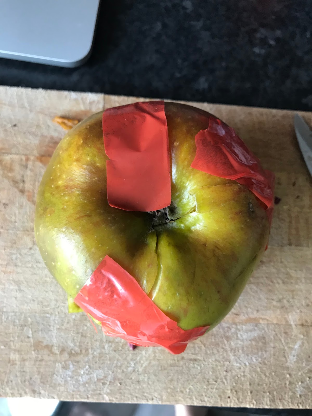
In terms of objects, I considered pitching ideas for products directly related to the No Wave movement such as a pack of cigarettes or a spray can or a roll of super 8 film. However, these ideas seemed very generic and the film time-consuming, so I decided to stick with my original train of thought around creating things out of apples to reference the defunct Big Apple branding. This concept has gained a little traction with me smashing up an apple and sticking it back together with the signature red tape and the idea of even smashing up multiple apples to form one big apple presented. However, the major problem with these thoughts is that the apples, once deconstructed will not keep for very long as the air gets in. Also, the end results looked a bit amateurish as seen below. With this in mind, I have decided to follow advice and push on with the idea for a crate of apples that each have different No Wave-inspired stickers on them and are perhaps even painted or taped for various reasons. This concept was agreed to be strong and effective by peers so is definitely something to take forward.


Sketches of objects:

No comments:
Post a Comment