On my first trip to Headingley a couple of weeks ago I managed to find a good selection of new wave and synthpop cassettes including the likes of Yazoo, Ian Dury and Depeche Mode. These are some of my favourite UK artists from the era so were a great start to the collection. At the time I hadn't fully formed the idea of cutting up and reassembling j-cards so I only purchased my favourite two designs from an aesthetic standpoint which were Yazoo and Depeche. Which were themselves very different in terms of design with the clean lines and ultra cool photoshoot of Yazoo and the much rougher, burnt out effect given to Depeche Mode. Both designs were very functional with the tracklist on the small back panel, however, this would not be possible when screen printing as it would be too small. I really regret not getting the Ian Dury tape as it was gone the next time I went in. The bright colours and cheesy photograph are exactly the kind of overly polished design I should be opposing with the No Wave tapes. I also picked up an unrelated opaque red and clear plastic box to give me the variation between clear, red and black.


I then returned to the same charity shop last Wednesday, where to my surprise I think there had been some turn over of stock. I picked up 3 more cassettes that fitted in with the now established purpose of being the genres No Wave opposed. It was really interesting looking deeper into the production value of each cassette as it was immediately apparent the era they were from and the budget. The Q-TIPS design featured perforated folds and no back print vs the 1986 Police compilation that had a unique, black tinted, rounded edge case and contained two sides of extensive full-colour photography. Despite cassettes not being quite perfect contextually in terms of location and timing they still fit in with the restrictions I have set myself and will work with the concept well. I also found a classical music collection of tapes which gave me a fresh perspective on the way tapes can be packaged. One other notable mention goes to the red and black tape is pictured as it seemed to fit with my aesthetic, so far, well. The concept of a torn cover is very much something I need to explore.


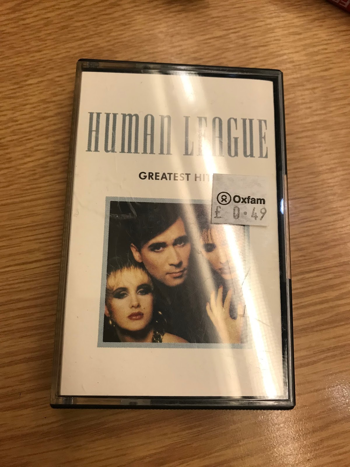
In one final trip in search of tapes, I today ventured round Edinburgh in search of further material. Once again this was fairly fruitless with few shops stocking them. However, I was happy with the purchase of another late 70s favourite of mine Human League. This design was very crisp and minimal, exactly the kind of layout I will be opposing making it a perfect addition. I have also noticed that a few cassettes have coloured opaque or transparent tapes as pictured below in black. Perhaps a red tape would be good for me, it is definitely something to look into. I am definitely going to have to extend my j-card from the 3 panel shown in initial ideas, not only to fit information on but also to make the most of all of these donors.
Also in Edinburgh, I managed to find a set of 3 blank TDK cassettes that look distinctively 70s and would be perfect for recording over. These came with a case and a set of TDK branded stickers. This reminded me that I need to work on some apple stickers for application to the outside of my case. Also, I think the cases found would be fine to use on the final 3 tapes. Ben emphasises the importance that all 3 of my tapes had consistent packaging so as to not take the shabby aesthetic too far. I had considered buying in some red boxes however I feel these will work better with the red accenting and are the perfect translation of the makeshift nature of no wave. I need to make the products look as if they were produced amateurly but with exceptional attention to detail and professionalism to gain the correct aesthetic.


No comments:
Post a Comment