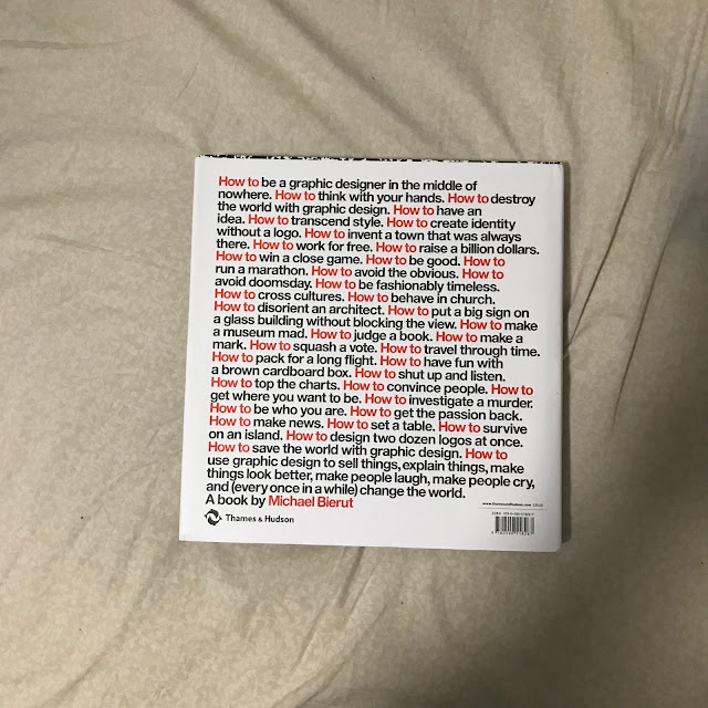
Adding emphasis to words and images is easy in a muted or black and white colour scheme publication. Any strong primary colour if applied well can be very effective. Part of the inspiration for my third publication was the cover art for Michael Bieruts graphic design guide 'How to'. The content of the book is also generally inspiring however theres nothing too applicable to this brief.


No comments:
Post a Comment