Today we were given an introduction to a series of two short, research and experimentation briefs. The brief begins with a publication focusing on colour. I have been given Pantone Emerald as a starting point. The colour should be used throughout my publication and should be a focus of my research.


Things that are emerald green:
Emerald stone
Green glass bottles
The sea - nautical link
Algae and moss
The rainforest - plants
Reptiles and amphibians
part of a peacocks plumage
vintage furniture
beetles, ducks heads - iridescent with black
Emerald Swallowtail butterfly
Emerald stones are symbols of elegance and sophistication and are normally mid to dark green in colour. However I feel the pantone interpretation is more playful and energetic. From a colour psychology perspective green represents harmony, balance and growth. This could be explained by looking at the natural resources and creatures that are green. It has a strong link to nature although emerald itself occurs less frequently. I feel emerald has more of a mysterious side perhaps due to its darkish tone and slightly blue tinge. "It is an inspiring and uplifting colour suggesting abundance and wealth in all its forms, from material wellbeing, to emotional wellbeing to creative ideas." - www.empower-yourself-with-color-psychology.com/color-green
I could explore this further my asking people how the shade I've been given makes them feel.
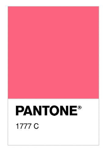
Pantone 1777 C is the most accurate complimentary colour I could find for Emerald. It similarly a more tranquil shade of pink that is less intense than hot pink but of a similar shade. Finding this colour gives me potential to work with the two as a means of contrast whilst maintaining the correct hue and therefore aesthetic. If I wanted to create more contrast and therefor make a certain colour stand out then I would select a colour that is not only opposite on the colour wheel but also in a completely different saturation/intensity.


No comments:
Post a Comment